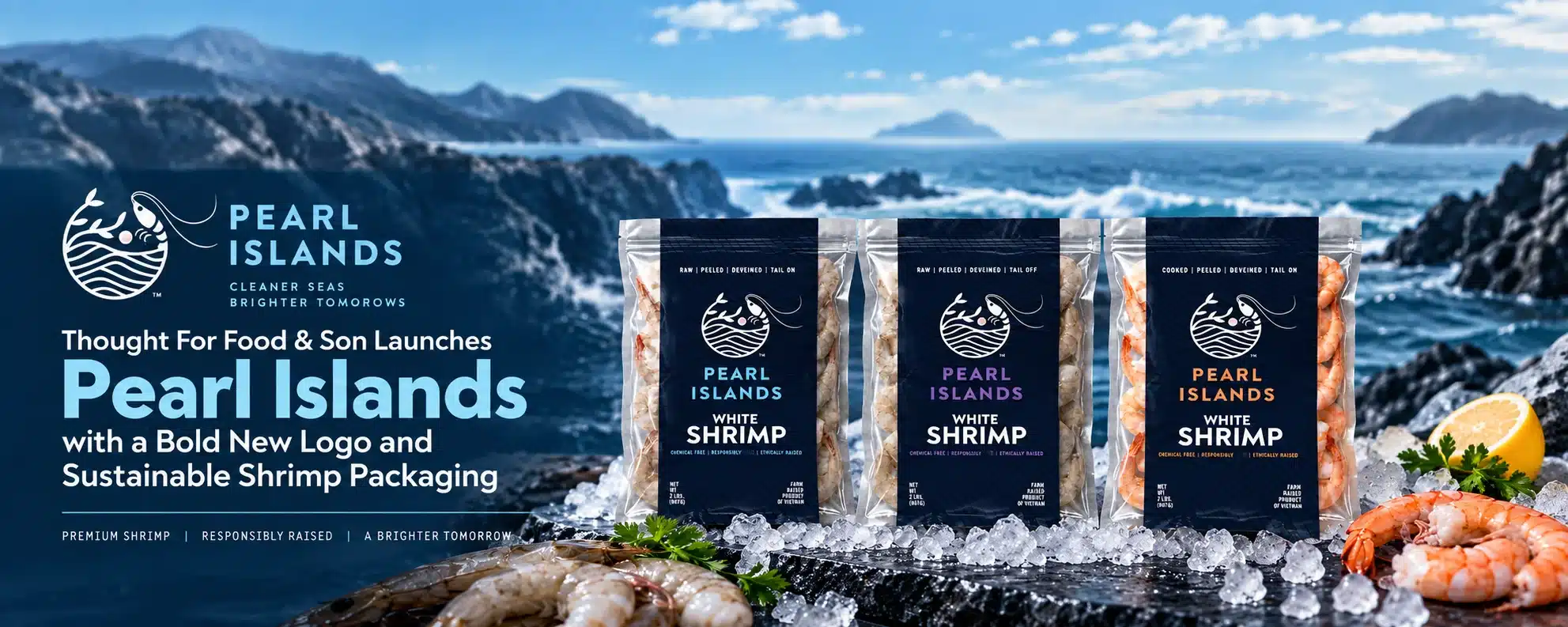
To bring the brand to life, Darik Enterprises partnered with Thought For Food & Son to create a distinctive logo, packaging system and brand identity that would communicate quality, transparency and sustainability.
As a completely new brand entering a competitive shrimp category, Pearl Islands needed an identity that would immediately capture attention and clearly communicate what made the product different.
The company sought to:
- Create a memorable logo and brand identity from the ground up.
- Develop packaging that communicated a clean, premium and sustainable product.
- Establish strong visual recognition across multiple shrimp varieties.
- Design a flexible packaging system for retail and foodservice channels.
- Clearly highlight important product attributes, including chemical-free, responsibly raised and ethically sourced shrimp.
The Solution: A Clean, Modern Brand Identity
Thought For Food & Son developed a complete brand and packaging system designed to position Pearl Islands as a modern, trustworthy shrimp line.
The creative direction combines contemporary seafood imagery with clean typography, strong contrast and clear product communication.
Key steps in the process included:
Logo Development
- The Pearl Islands logo combines a shrimp, ocean waves and natural plant elements into one distinctive icon.
- The circular design communicates the connection between the product, the ocean and responsible aquaculture.
- Clean lines and a modern presentation give the brand a premium appearance while remaining approachable to consumers and foodservice buyers.
Packaging Design
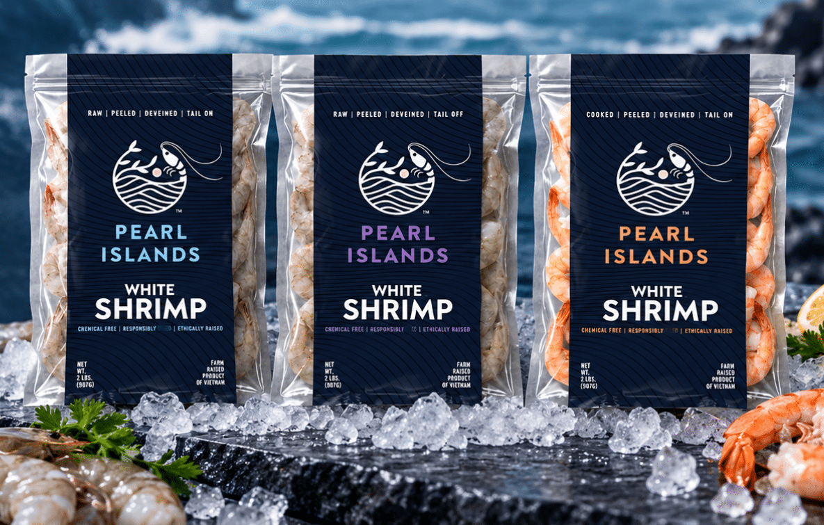
- A deep navy background creates a sophisticated appearance and allows the shrimp to remain visible through the clear packaging.
- Bold white typography makes the product name easy to identify at a glance.
- Color-coded Pearl Islands branding distinguishes each product variety while maintaining a consistent family appearance.
- The vertical layout provides strong visibility in retail freezer cases and professional presentation for foodservice customers.
Clear Product Communication
- Product forms such as raw, cooked, peeled, deveined, tail-on and tail-off are prominently displayed.
- Key brand attributes, including chemical-free, responsibly raised and ethically sourced, are clearly communicated on the front of the package.
- Essential product details are organized for quick identification by consumers, retailers and foodservice buyers.
A Flexible Brand System
- The packaging was designed to support multiple shrimp varieties and future product extensions.
- Consistent design elements create immediate recognition across the complete Pearl Islands line.
- The system gives Darik Enterprises a unified brand platform that can grow across retail and foodservice channels.
The Results: A New Brand Ready for Market
Thought For Food & Son transformed the Pearl Islands concept into a polished, market-ready seafood brand with a strong and cohesive visual identity.
- Strong Shelf Presence: The bold navy packaging, clean typography and visible product create immediate impact in the seafood aisle.
- Clear Brand Positioning: The design communicates a premium, clean and responsibly raised shrimp product.
- Easy Product Navigation: Color coding and prominent product descriptions help customers quickly distinguish between varieties.
- Retail and Foodservice Flexibility: The scalable design system supports the needs of consumers, retailers, distributors and foodservice buyers.
- A Foundation for Growth: The completed identity gives Darik Enterprises a recognizable platform for expanding the Pearl Islands product line and building long-term brand awareness.
The Natural Choice for Food Companies

Title

Title

Title

Title
Contact Us
(508) 361-2970
info@tffandson.com
Address
Thought For Food & Son, Inc.
910 Boston Post Road, Suite 140
Marlborough, MA 01752